A compelling and well-thought-out product page is the key to converting a lead into a customer. Good eCommerce product pages can help increase sales and can also make your website more user-friendly.
Product pages are where users make their final decisions about purchasing. eCommerce businesses work really hard to drive quality traffic to their websites. However, some of them don’t realize the importance of optimizing their pages and end up with a poor conversion rate.
Product pages can make or break your sales. However, the good news is that you can optimize various aspects of these pages to improve the user experience and increase conversions.So, we've decided to provide you with a comprehansive product page guide that will help you to gain competitive edge on the market.
Let’s take a look at the elements that make up a perfect product page.
1. Product Name
First and foremost, the first product page element that shoppers will see is the name. It should be large and bold. Names need to be descriptive and provide clarity to consumers about what their looking at. They need to be optimized for search engines too. This will help you your pages get discovered in searches easily.
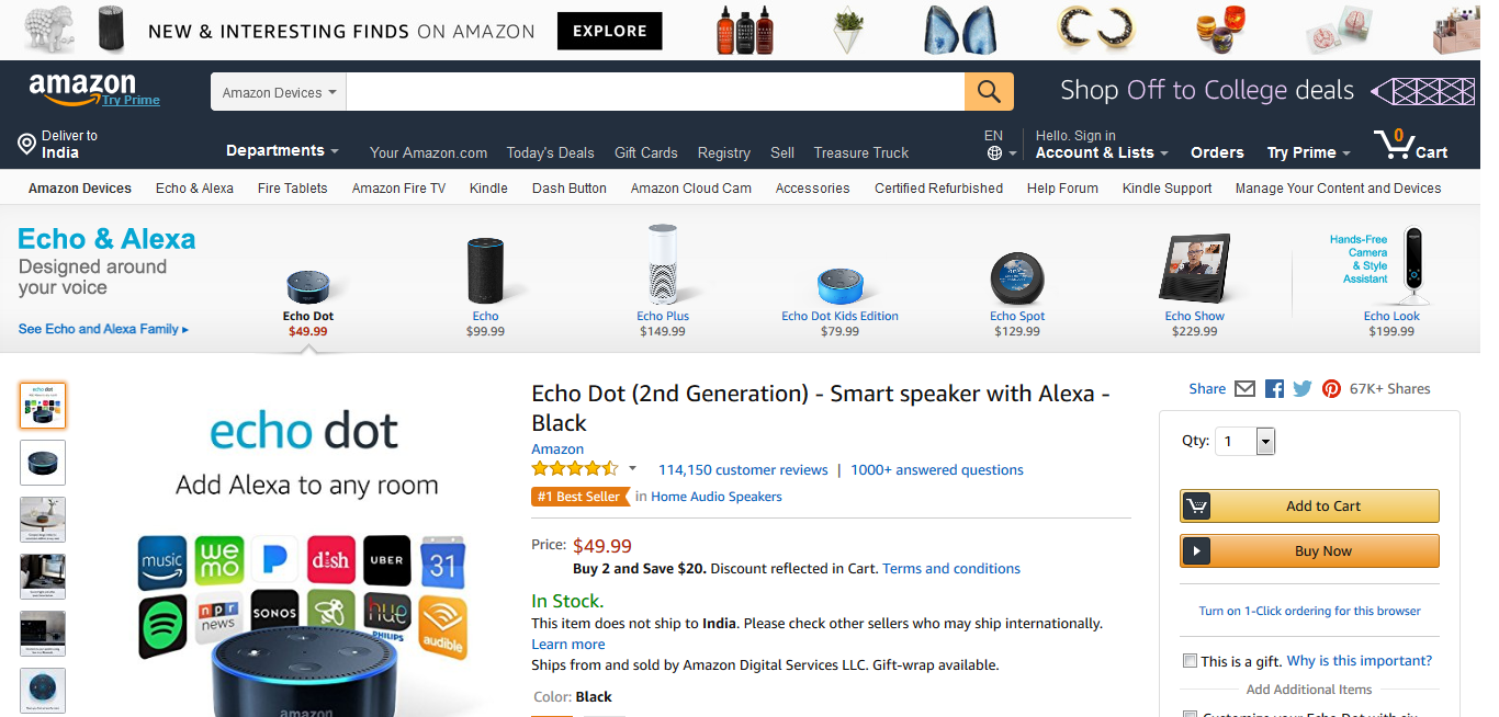
Image via Amazon
Try to ensure that your product page names are unique. If they match too closely with those on other websites, it might be difficult to obtain a better rank in search engines. The SEO competition between product pages is higher than ever and every seller out there tries to create a perfect one, that will be attractive to both shoppers and search engines.
2. Product Image
Images can have a huge impact on people’s purchase decisions. High-quality images provide a great experience to users and can help increase conversions. They depict a product better than any textual content can. Ultimately, product page design overall will be a determening factor in the coversion rate, and there is nothing that speaks great design than high-quality images.
Make sure to upload multiple images on your pages. Take photos from different angles to showcase the products well. Also, ensure that the photos are visually appealing. You can also encourage your customers to share their photos of the items they’ve purchased from you.
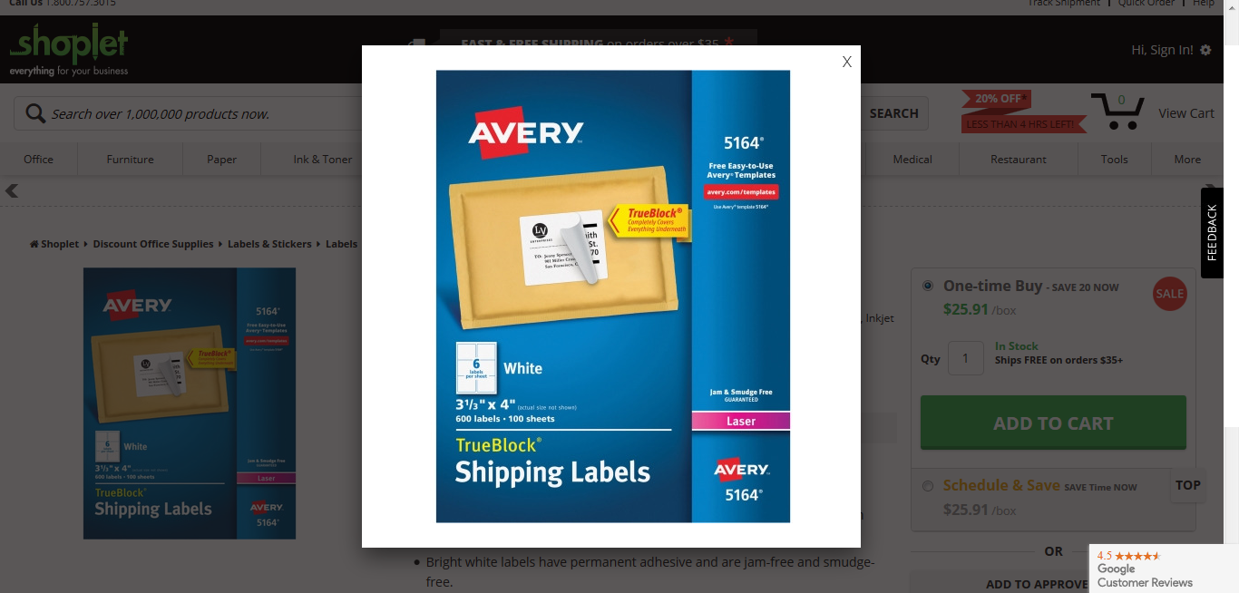
Image via Shoplet
While high-quality images are essential to provide a good user experience, you should also pay attention to their size. If your images are too big, the page will take longer to load and this will create a less than optimal user experience.
You might need to resize your images before you upload them. Just make sure that resizing them doesn’t affect their quality.
3. Call-To-Action Button
As far as the product page design goes, the call-to-action (CTA) button is an extremely important, if not the most important aspect of your product page. It’s the element that can ultimately decide if the visitor will make a purchase or not.
CTA buttons need to be attractive and should stand out on your pages. You need to make it easy for visitors to find the button so that they can make their purchases without too much effort. Which means you need to take extra care to make sure your CTA buttons are noticeable.
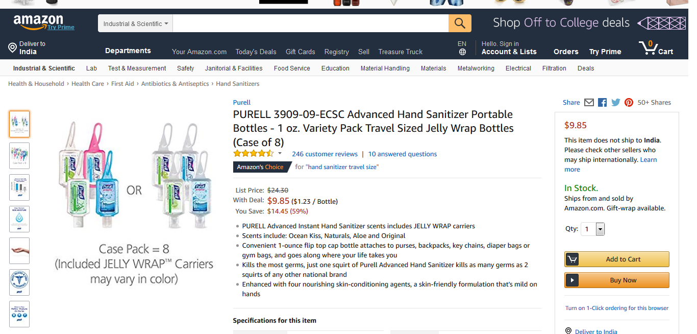
Image via Amazon
The colors of the CTA button should be in contrast with the background color so that it stands out. It should also appear at multiple places on the page where visitors can easily spot it. The text inside the button should be compelling and should prompt the visitor to take an action. You can tailor the text based on your target audience, in order to make product page design cohesive with the rest of your business.
4. Product Price
This is the one element that you really cannot control. The price needs to appear at some point on your product page. It should ideally be placed pretty close to the CTA button. This is because all of the essential information on your product pages need to be placed so that it’s easy for visitors to find.
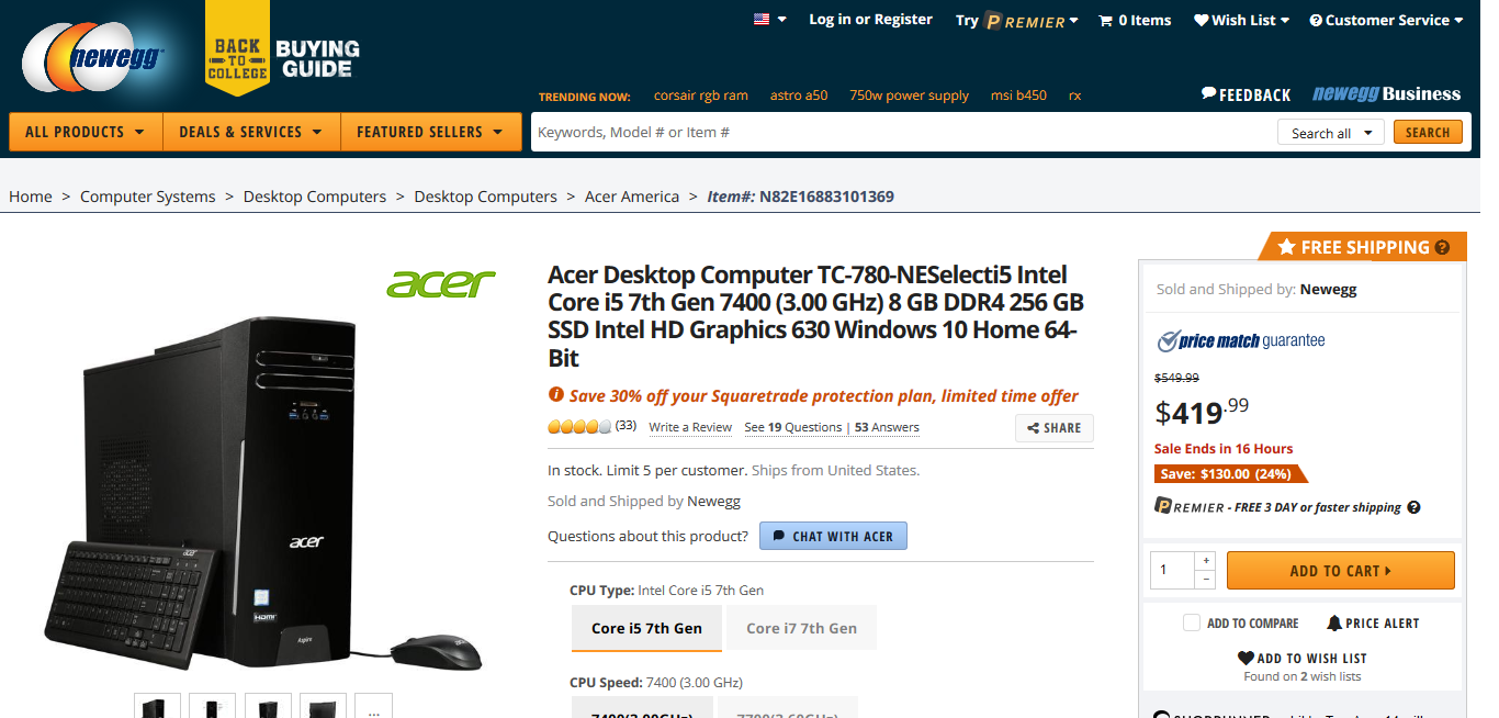
Image via Newegg
The product name, the price, and the CTA should be located close to each other. This makes it easy for visitors to find them and make a purchase quickly. You need to make sure that the price tag looks attractive too.
5. Product Description
Read any product page guide out there, you may have a great product, but without a good description, it can be difficult to sell it. A well-written description is necessary to provide website visitors with information about the product’s uses and features. It is the essential ingredient that makes an ecommerce product page successful.
Try to write engaging and compelling copy for your product descriptions.

Image via eBay
Don’t make them overly promotional as it might put off some people. Make them concise and use relevant keywords in them. This can improve your on-page SEO and help the page rank higher in searches. This, in turn, can drive more traffic to your website.
6. Recommended Products
Having a dedicated section for recommended products on your site is a great idea. This section should ideally be located just below the actual product so that visitors can see it immediately. Recommended products can help you increase your sales by offering more options to website visitors.
When they see these products, it might prompt them to check out other options available at your site too. So they’ll remain on your website much longer, which can help boost your search rankings. Additionally, they may end up liking the recommended product and may purchase that as well.
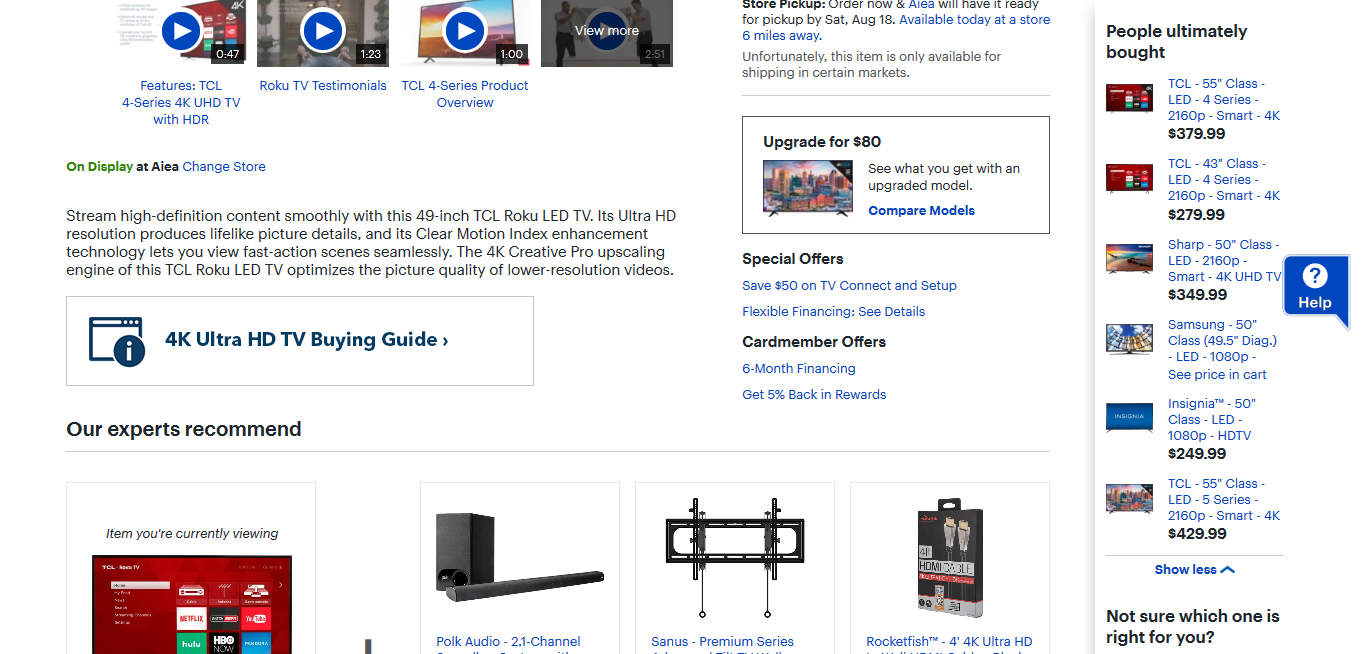
Image via Best Buy
The recommended products can be similar or complementary to the ones you showcase on a the page. For example, you could showcase accessories of the item. Or you could showcase products that were also purchased by other people who purchased that particular item.
7. Product Reviews
Reviews are extremely helpful in selling your products. In fact, a study by BrightLocal found that 85% of people trust online reviews as much as personal recommendations. This statistic shows how important buyer’s reviews are. Any perfect product page should have perfect reviews.
You should encourage your customers to write reviews for the products that they’ve purchased. Then you can display those reviews on your product pages for other visitors to see.
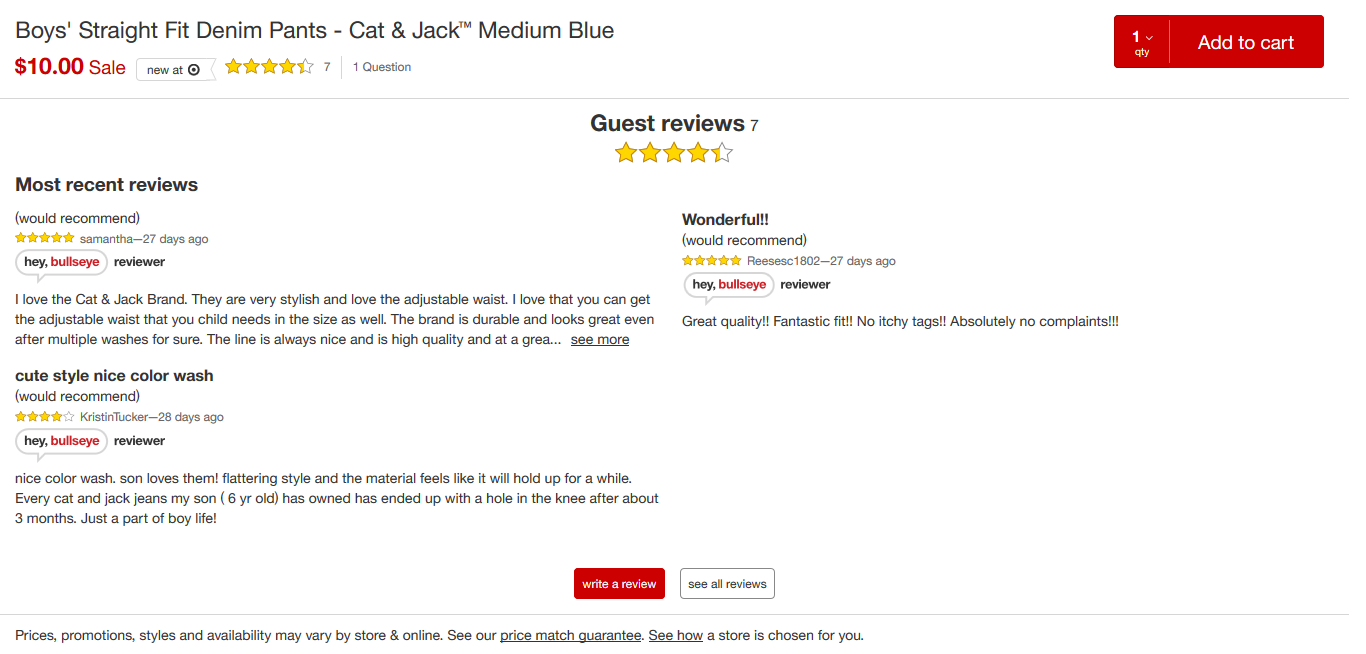
Image via Target
If there are any negative reviews popping up, try to solve the issues that those people had. This will give a positive impression of your brand.
8. Add to Wish List
This option is very helpful and can help you get repeat customers. You can give them an option to add a particular product to their wish list. Even if they don’t make the purchase immediately, they may purchase it at a later time. Which ultimately means that one of your ecommerce product pages will assist another.
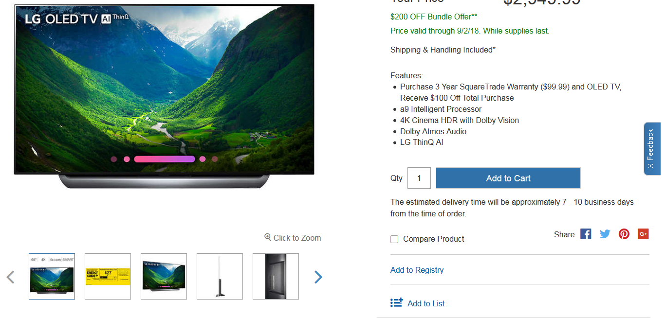
Image via Costco
This bookmarking option gives them the flexibility to remember the product. It opens up avenues for you to get more purchases from the same person again.
9. Delivery and Return Information
This is yet another extremely important piece of information that every consumer wants to see. Before making a purchase, they want to see all of the hidden costs. If they only see it during the final page of the checkout process, they might get disappointed.
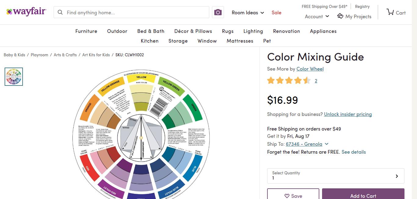
Image via Wayfair
So make sure that you display all of delivery charges, taxes, and return related information upfront. You can mention an approximate delivery time and can even include a short statement about your return policy.
10. Savings
There is magic in numbers, especially if you’re offering a discount on certain products. The product page should show the original price of the item as well as the discounted price. Along with this, you can even show the percentage discount or the discount in numbers.
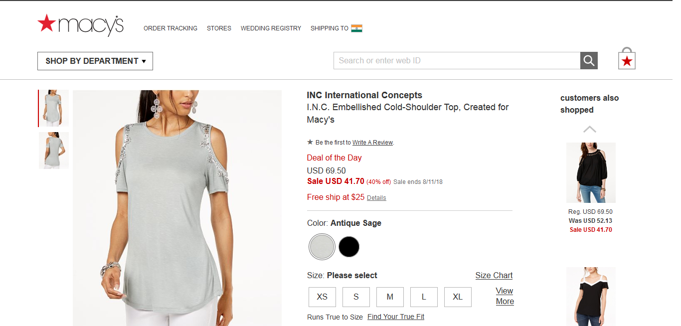
Image via Macy’s
Using this technique, you can show your visitors how much money they are saving by purchasing from you. Seeing this, there is a good chance that people might complete the purchase.
11. Live Chat Support
This is a great option to include on your product pages. Providing live customer support ensures that the customer’s query is resolved instantly. Live chat can increase your eCommerce conversion rate by 8X.
If customer queries go unanswered for a long time, they may lose interest in the product or the website. If they are addressed instantly, they may consider purchasing instantly.
12. Integrate Social Media
Social platforms are great mediums to promote your eCommerce business. Moreover, today social media can take eCommerce product page to the next level of popularity. Ensure that there are social share buttons on your product pages. This makes it easy for people to share the product with their circles.
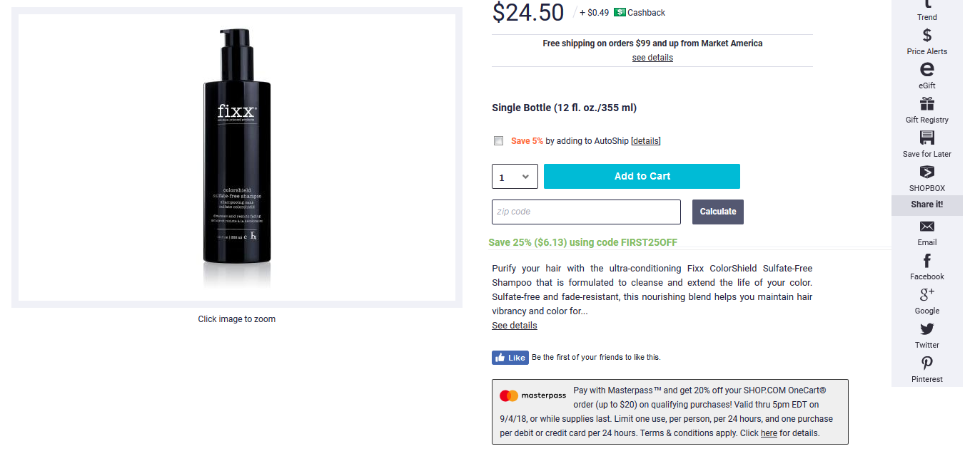
Image via Shop
This can help increase awareness about your brand and products as well as increase traffic to your website. It also works as social proof. Those who see the product may even end up purchasing it.
13. Product Videos
While most eCommerce websites only have product images, you can add videos to your product pages. They help convey information in a much more efficient manner and can help to improve conversions. They are a great way to boost your eCommerce business growth. Of course, creating an entire video for an item is the most expensive product page element. But, at the same time it can be incredibly cost-effective in the long-run.
You can even use them to provide information related to your products. They provide a more realistic picture of what an item looks like and how it works.

Image via Kelty
Kelty uses videos to market their outdoor products. Their videos give consumers more information about how their tents look and how other products work.
Final Thoughts
A perfect product page needs to have a lot of information for your visitors. However, you need to ensure that it doesn’t look too cluttered. This can create a bad experience for the user. Smooth navigation coupled with engaging, attractive, and informative content can help your visitors sail through the purchase process.
Can you think of any other important element of a perfect product page I may have missed? Let me know in the comments below.
Start Selling More with Our eCommerce Software


